The Art of the Label
There are no limit to creative applications in wine label design
By Karl Klooster
With so many Yamhill Valley wineries showing their independent spirit, what goes on the bottle is proving to be even more diverse—if not more delightful—than what goes in it.
The wine label designs, and the process to arrive at them, have so many different takes it would take a book to describe them all.
Marketers will tell you one of the most important purposes of a wine label should be shelf presence, to attract a potential buyer’s attention by making it stand out from competitors. But if that were its only purpose, large type and bold colors would do the job.
The message conveyed by a wine label goes well beyond that single goal. For Oregon wines, in particular, the label makes a statement — often a very personal one — about the people who have committed their lives to the product inside.
Here are just a few examples that represent a broad range of artistic styles and graphic techniques, and which show the almost limitless possibilities that can be explored when seeking to establish a unique identity.
Among the following examples, you will find everything from portraits to period photography, abstract art to bold typography, vineyard scenes to bird and animals, line sketches to crests and monograms.
Breaking the designs down into specific groupings is a useful approach, and for that we’ve used very broad categories. Some labels, of course, employ elements from multiple categories – the dominant element dictated which group it best fit into.
These are a few of the distinctly individualistic expressions from an industry noted for its intense individuality. They state, in no uncertain terms, “label me Oregon.”
 PEOPLE / Adelsheim Vineyard
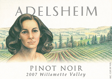
Human beings, both in close-up detail and full form, appear on many labels. The very first to use people was pioneering Adelsheim Vineyard, whose co-owner, Ginny Adelsheim, is an accomplished artist.
David and Diana Lett became fast friends with the Adelsheims early on. Ginny chose to do a full-color portrait of Diana for the label of their signature wine, Pinot Noir.
It set the precedent for female portraiture as the identifying theme for the winery’s subsequent wines, upon which other friends were depicted.
Among them is the Elizabeth’s Reserve Pinot Noir, named for the Adelsheim’s daughter, Elizabeth, who is shown in profile on the label. Ginny’s sensitively rendered line drawing speaks silently of a mother’s love for her daughter. The detailed piece is reproduced in a muted lavender.
 PEOPLE / Ken Wright Cellars
Initially, Wright’s wine carried a simple, but tasteful, typography-only label. During an out-of-state trip, he looked for his wine on a retailer’ shelves. Unable to find it, although it was there, he concluded a design change was in order.
That need now firmly in mind, Wright was steered by a friend to an art gallery in Portland’s Pearl District, where paintings by Paris-born artist David Berkvam were being shown.
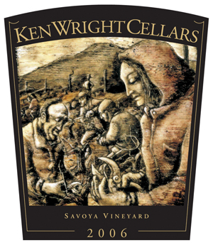
A discussion with Berkvam led to the commissioning of a piece whose concept was to be “honoring seasonal workers.” Wright also expressed to the artist his leanings toward a traditional, Old World style. The result exceeded expectations.
A hooded vineyard worker dominates the foreground of this powerful, artistic statement that could easily be mistaken for a centuries-old painting of a scene in the heart of Burgundy. It first appeared on labels for the 2000 vintage.
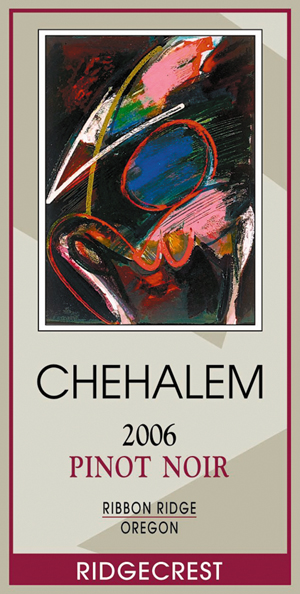 MODERN / Chehalem
Co-owner and head winemaker Harry Peterson-Nedry has declared, “From the beginning we had to have an art label. It was important because I believe the package should reflect what’s inside.
“As a part of a full, rich, balanced life, fine wine provides the same connection to an almost spiritual appreciation of the world around us that art does.”
In 1992, some close friends who are art collectors introduced him to the work of Portland-based abstract artist Ted Katz and then to the man, himself. Katz’s work has graced Chehalem’s bottles ever since.
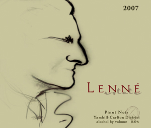 ARTWORK - SKETCHES / Lenné
The play on words was right in front of his face when Lenné’s owner Steve Lutz named one of his wines Le Nez—“the nose,” in French. This was reinforced by the fact that Lenné is, itself, a play on words, honoring Lutz’s father in law, Lenny.
The large proboscis profile of Lenny on the label was rendered in charcoal by graphic artist, Maja Bosen. Lutz feels it has done its job well, creating a unique identity for the winery.
Carrying that concept a step further, the Le Nez Pinot Noir label shows just the nose. It’s definitely a situation wherein the nose truly knows how to sniff out the best.
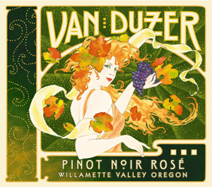 ARTWORK - SKETCHES / Van Duzer
One of the most colorful and classy labels around, Van Duzer’s design takes its inspiration from the international Art Nouveau movement that reached its peak of popularity at the turn of the 20th century.
Winemaker Jim Kakasek said they wanted a period approach and initially considered Art Deco before deciding Nouveau’s fluid asymmetrical motif suited the look better than Deco’s rigid symmetry.
Symbolic elements appear throughout the design, most prominently Zephyra, the goddess of the west wind, whose flowing hair is wafted by the Van Duzer Corridor’s beneficial breezes. Anstey Healey Design (now called Flint Design Co.) in Portland executed the label.
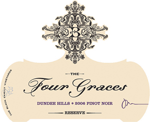 CREST – MONOGRAM / The Four Graces
Appropriately, “graceful” elegance best describes the label design into which all members of The Four Graces’ ownership family apparently had input.
The Blacks—Steve, Paula, their four daughters, Alexis, Vanessa, Christiana and Jullian and son, Nicholas—wanted a monogram. Steve and Paula wanted something that would honor their four daughters.
Alexis, a graphic artist, accommodated those desires. Her parents and siblings signed off on the flamboyantly embellished “B” and overall concept she created, which they sent on to Portland-based Flint Design Co. for the final touches.
General manager Anthony Van Nice said the completed label, with its intricate die-cut edging, gives the production crew fits whenever they have to apply it, but everybody else loves it.
Not incidentally, lone son Nicholas wasn’t left out. He is the “Keeper of the Four Graces” on their reserve Pinot Noir label.
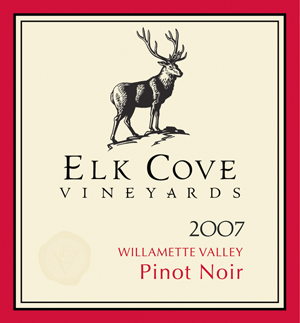 BIRDS & ANIMALS / Elk Cove
The elegant Roosevelt Elk that appears on many of Elk Cove’s labels is the second stately wapiti to represent the winery in the public marketplace. It’s had a decade-long run thus far and, according to owner/winemaker Adam Campbell, there are no plans afoot to remove, replace or reinvent him.
Given that this proud animal was a resident of these coastal hills long before the Campbells came on the scene, it’s fitting that they’re being honored in this manner as well as with a vineyard-designated Pinot Noir and a handsome event hall at the winery.
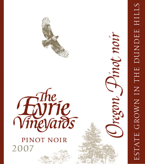 BIRDS & ANIMALS / The Eyrie Vineyards
The stars must have been auspiciously aligned when Oregon’s iconic wine couple, David and Diana Lett, were seeking a designer for their Eyrie Vineyard label. But how their quest met with success requires a little explanation.
In the mid-1960s, David was still supplementing the family income selling college textbooks. He had become acquainted with numerous administrators and faculty members, one of whom was Reed College art professor, Lloyd Reynolds.
Reynolds, who gained acclaim as one America’s most accomplished calligraphers, had a close friend and former student named Doug Lynch. Reynolds recommended Lynch, by then a Portland graphic designer, to the Letts.
An immensely talented artist and calligrapher in his own right, Lynch leapt at the opportunity to design a wine label, an assignment previously unheard of in the Pacific Northwest.
Diana Lett said they told him to forget any traditional Old World notions about wine labels. They wanted something fresh and original, something that made a unique statement about Oregon and The Eyrie Vineyard.
Lynch visited the Dundee Hills, talked with them and took photos of the property. The rest, as they say, is history. The Letts were rewarded with a label design that has stood the test of 40 years time and the Oregon wine industry had a sophisticated symbol for its Pinot Noir story.
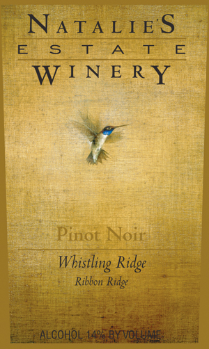 BIRDS & ANIMALS / Natalie’s Estate
The humming bird flits from flower to flower taking a tiny taste of the best here and the finest there, until, after an expenditure of prodigious effort and boundless energy, the diminutive avian ends up with a small stockpile of precious nectar. That metaphor served as Boyd and Cassandra Teegarden’s inspiration for making the image of a hovering humming bird the centerpiece of their warm, parchment-like Natalie’s Estate label.
A different label design was called for when the couple launched their Rock Horse Ranch brand. This time the influence was primordial rather than ornithological. Taking a page from pre-history, the design replicates a cave painting of a horse’s head and neck in profile.
Mottled, earth-toned patterns intersect to form the image, while the surface could be damp slate or some other smooth, moist stone. Surrounding this richly textured image is a black and gold border; the graphics makes a stunning statement.
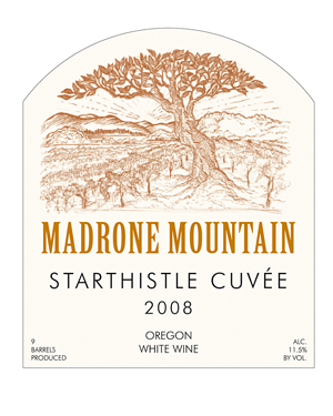 TREES & FLOWERS / Madrone Mountain
Co-owner Don Mixon said their label design was sheer serendipity. He and partner Bret Gilmore were sitting around sipping wine one afternoon with an artist friend who did a line drawing of a tree in their front yard while they were together. He added some rows of vineyards, which weren’t yet planted, and the key visual element of the label was ready to go.
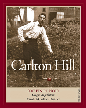 PHOTOGRAPHY / Carlton Hill
Two of David Polite’s favorite forms of entertainment are shooting billiards and playing croquet. Ever since his vineyard on a hillside west of Carlton began bearing fruit, he was also able to sip his own Pinot Noir while doing both.
When it came time to bottle the first commercial vintage of his favorite beverage in 2000, he found himself in need of a label.
Good friends Chris and Hilary Berg were over one evening when he brought up the subject. Chris, a winemaker and grower had been helpful in that regard. Hilary, then a graphic designer and now Oregon Wine Press editor, said she’d work on some ideas.
Knowing Polite’s passion for croquet, she scoured the Internet trying to find a photo or piece of art illustrating that theme. When she came across a classic 1910 postcard on eBay, her search was over.
“That was it,” Polite said. “This salt-of-the-earth sort of guy had exactly the look I wanted and the dilapidated barn behind him was in essentially the same relationship to my croquet court as my outbuilding. It’s worked marvelously for me ever since.”
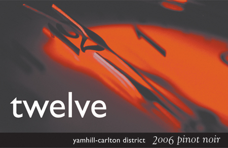 PHOTOGRAPHY / Twelve
According to winery founder John Lenyo, creative use of four-color photography was the only way to go for his labels. He wanted different ones for each wine and he selected McMinnville graphic designer Andrea La Rue of Nectar Graphics to do them.
Allowed the freedom to let her imagination run free within the nebulous constraints of the Twelve context, La Rue came through with a truly inspirational effort.
The result was a series of visually arresting photographic images, all of which incorporate Twelve in cleverly varying ways.
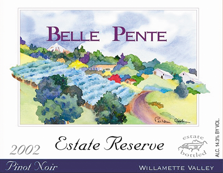 VINEYARD / Belle Pente
Not surprisingly, numerous Oregon wineries feature representations of vineyards, grapevines and grape clusters on their labels. Many are attractive and well designed. In our humble opinion, this is one of the best. The reason Belle Pente owners Brian and Jill O’Donnell chose to put a vineyard rendering on the label is easily understood if you know the translation of their winery name, “beautiful slope.”
Related Content
-
Read more...
7: Inside the Industry
Technology and artisanship are hallmarks of the wine industry, from custom-made barrels to personalized ...
-
Read more...
Rollbarrel making - Out the Barrels
Pacific Northwest's lone cooperage carves out a niche in McMinnville
-
Read more...
Wine Country visitors soon arrive 'Inside the Industry'
If wine is one of your reasons for visiting the Yamhill Valley, you've hit the mother lode
